CASE STUDY: STONE PILSNER PACKAGE DESIGN
Project Overview
Client: Stone Brewing
Project Type: Packaging Design, Branding, Light Illustration
Role: Senior Graphic Designer
Tools: Illustrator, InDesign and Photoshop
A summer release to be tested in the CA market (that transitioned to a core, nationally distributed product), this pilsner required a package design that communicated Americana without leaning political, reflected its lower ABV and lightness, and visually stood out in crowded craft beer aisles.
objectives:
Create a design that evokes “quintessential summer” and patriotic appeal without political connotations and don’t go overly patriotic like other beer brands
Convey drinkability and lightness (4.7% ABV — atypical for Stone)
Ensure shelf standout against highly saturated beer competitors
Deliver on a tight timeline and align across creative, marketing, sales, and executive stakeholders


PROCESS:
Market Research & Brand Strategy
Audited craft pilsners with similar ABVs for visual and positioning cues
Developed theme concepts and gathered Americana-inspired references
Considered the story behind the beer, brewer intentions, and subtle nods to ingredients
Concept Development
Created initial design directions for both primary and secondary packaging
Chose a minimalist white base (a visual contrast to colorful beer shelves) to signal refreshment and echo modern seltzer cues
Developed multiple mockups and directional decks to be shared
Stakeholder Alignment
Pitched concepts to internal creative team for feedback
Presented to executive leadership (VPs, CEO), brew team, and sales teams for approval
Managed iterative revisions based on cross-functional input
Execution & Production
Submitted final design for TTB approval
Built print-ready files and prepress assets
Rolled out full suite of branded deliverables:
Multi-angle mockups
In-store signage & posters
Digital (eCommerce, social, web)
Centralized Adobe Library for brand consistency
THE COMPETITION:

Here you can see that many Pilsner beer brands lean towards a lot of blues, greens and yellows in their color palettes. Most of these designs focus on a lighter or white background with “pops” of color most likely to emphasize a lighter beer style or sessionability. Also, several of these brands have very clean and minimal art on the package. They aren’t crowding the space with unnecessary “fluff” or they are illustrating circumstances where you might drink this beer (Green State, Uinta Lime Pilsner, Buoy Czech-Style Pilsner). Font usage is dispersed across most brands though serifed fonts or cursive fonts seem popular.
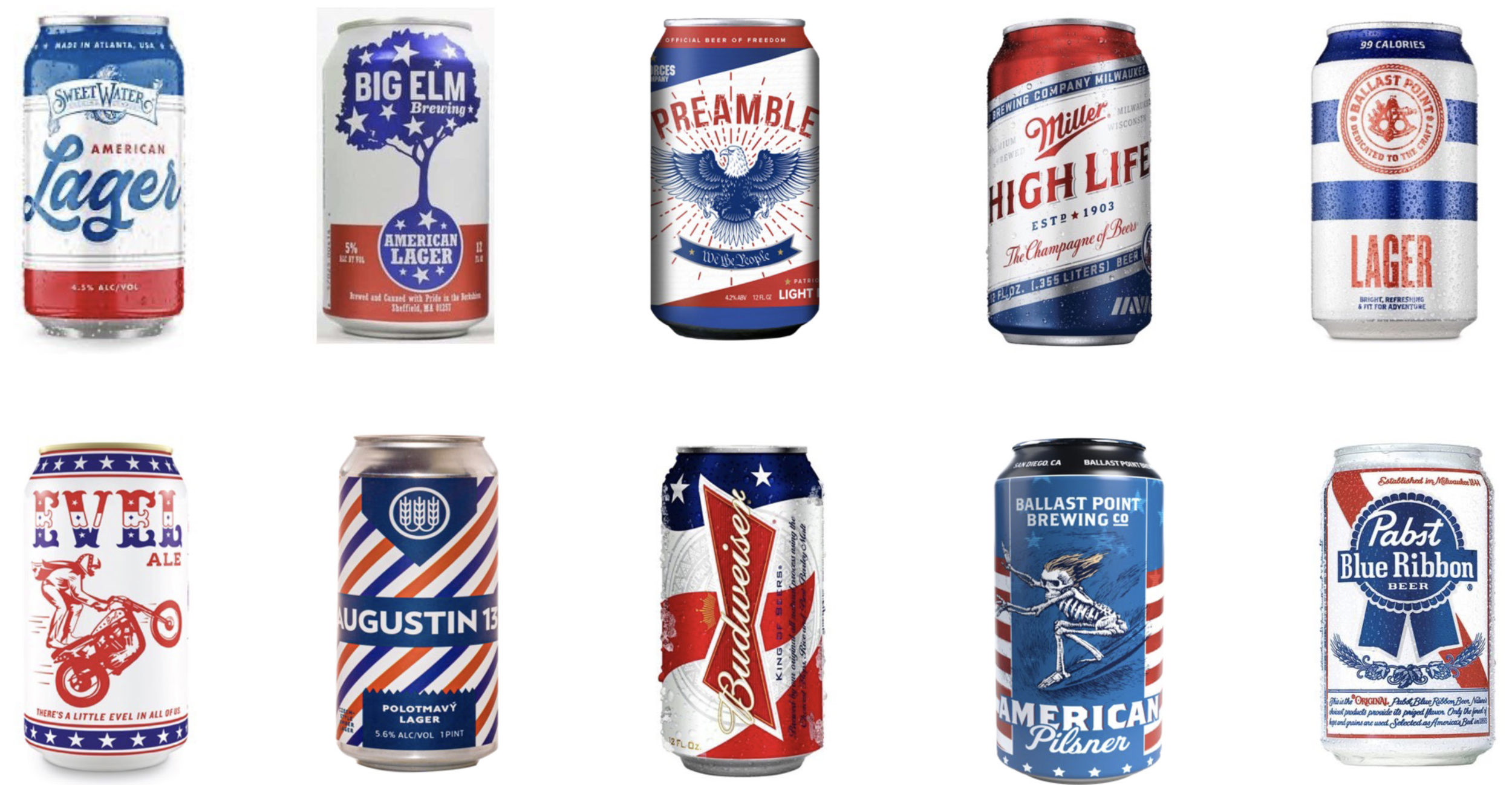
We also looked at several brands that weren’t necessarily pilsners but were Americana or patriotically themed/branded.
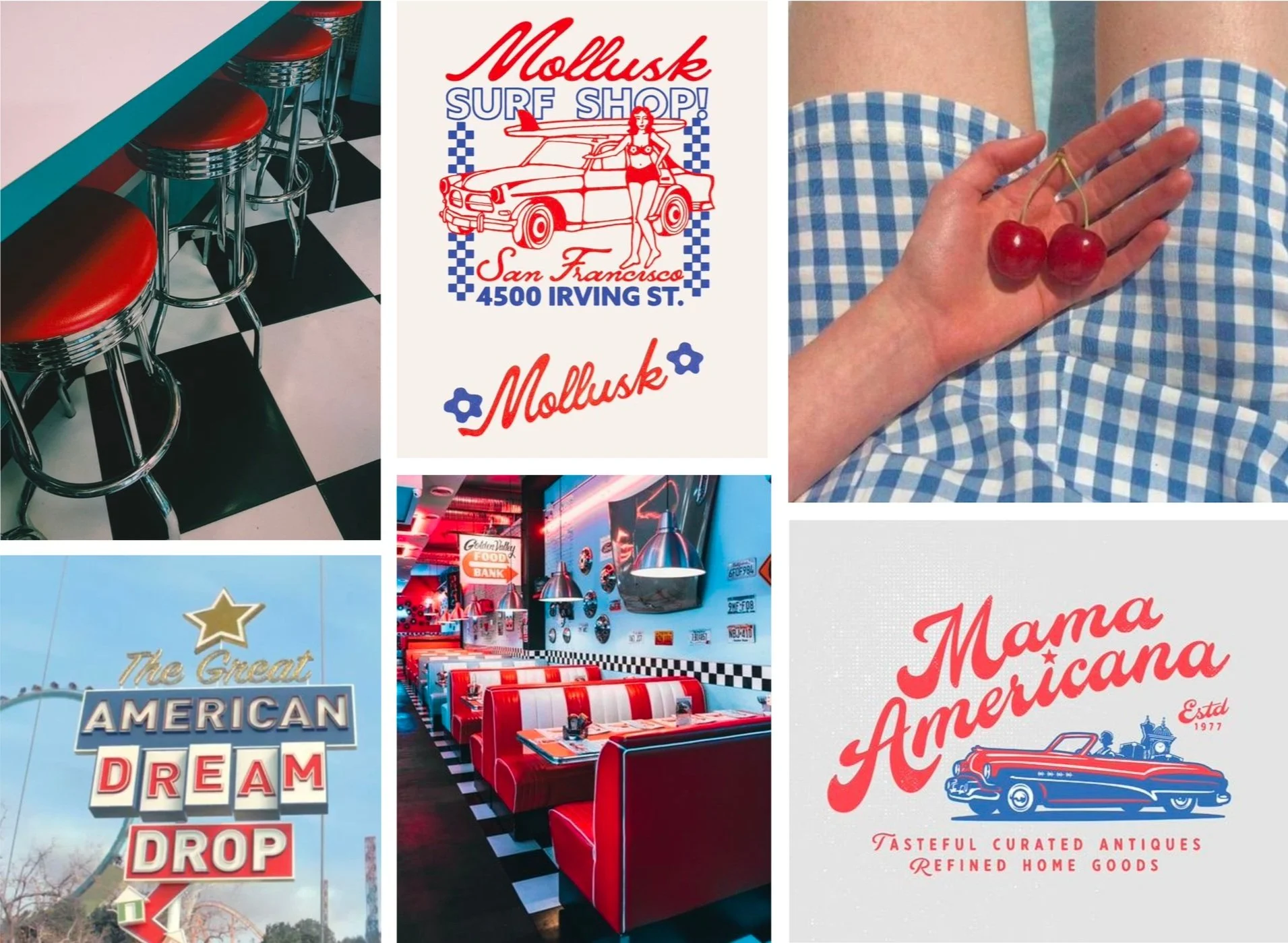
MOODBOARD & DESIGN OPTION 1: 1950’s AMERICANA
Americana evokes the spirit of mid-century American culture—the “apple pie” era. Our research drew inspiration from vintage diner signage, 1950s decor, menu typography, and era-specific merchandise. In execution, we replaced the traditional Stone chevron with a checkerboard pattern, nodding to classic diner tile-work and Southern California's surf/skate culture, where checkerboarding is a visual staple. Typography choices reference hand-painted signs and atomic-era lettering, with a small callout styled after 1950s automotive advertising.

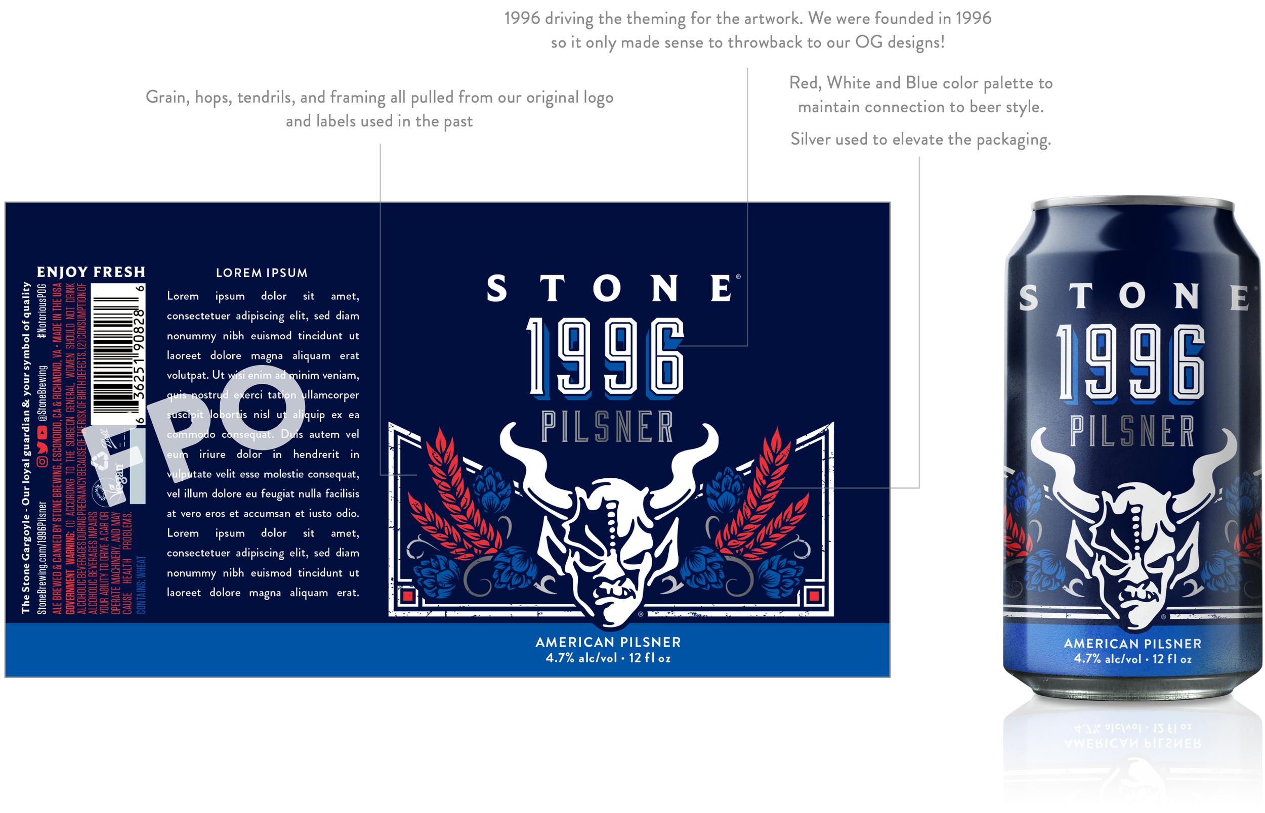
moodboard & design option 2: THROWBACK TO OG STONE
Originally considered under the name “1996 Pilsner,” this concept drew from Stone’s early roots as a foundation for the package design. In the past, brand differentiation relied heavily on color and logo usage rather than unique illustration. With our current templating constraints, we reintroduced heritage hop and grain elements from the original logo, integrating them into a chevron frame inspired by archival packaging. This approach pays tribute to our legacy while seamlessly aligning with the broader Americana theme.

MOODBOARD & DESIGN OPTION 3: STRAIGHT OUTTA THE 90’S
Stone’s roots in music run deep—our founders came from the music industry—so when exploring the “1996 Pilsner” name, we drew on that legacy. To reflect our auditory history, we created fictional mixtapes like Stone of the Ages, Back to the ’90s, and Stone & Roll Mix, using them as graphic devices to establish the chevron layout. The design was finished in a subtle red, white, and blue palette—hinting at Americana while keeping the focus on music, not politics.


ADDITIONAL DESIGN EXPLORATIONS DUE TO FEEDBACK:
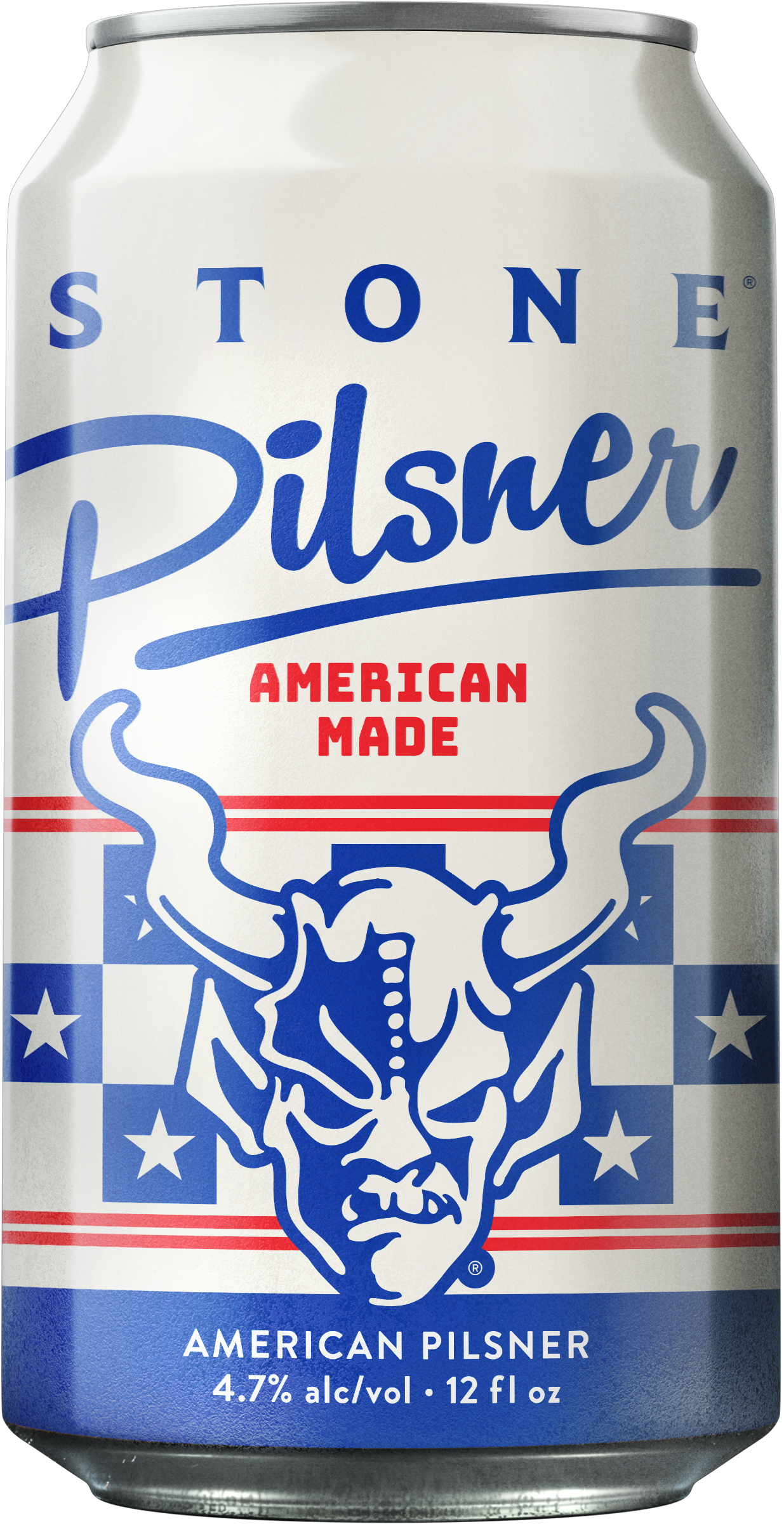
The first round had some snippets that were really liked, but ultimately option 1 above was the direction that ELT wanted to go in. They did want to make some alterations that included: aging the white of the can because its too stark the graphics are vintage so the white should be vintage, the checkerboard isn’t working as well as we hoped and the suggestion was to bring in more stars or more stripes to hint at the patriotic side of things just a touch more and lastly remove the automotive banner. Our approach to making edits when it requires revisiting the artwork is “mild to wild”. The Mild option uses the same base design but adds stars to the checkerboard and a second set of lines to allude to stripes, option 2 is the Medium design in that it foregoes the checkerboard and brings in stripes to match the chevron template with stars added across the shoulder, and option 3 is our Wild approach that throws away the chevron and brings in stars and stripes in an aviation set up. Option 2 is ultimately the design that was chosen for production.


OUTCOME:
Originally launched as a California-only test, the beer exceeded expectations and earned national distribution within a year. It’s now part of Stone’s core product line — a testament to strategic branding and resonant design that captured both the spirit of summer and the evolving preferences of Stone’s consumer base.


